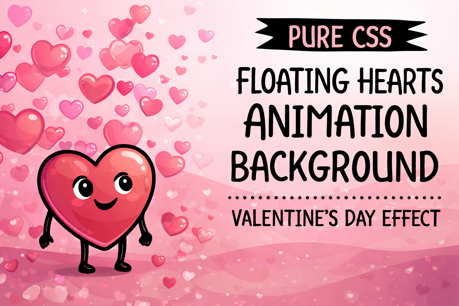
With Valentine's Day approaching, a subtle yet eye-catching floating hearts animation can transform any webpage into a romantic experience. This pure CSS effect creates hearts that gently rise from the bottom of the screen, fade in and out, and drift upward – all without a single line of JavaScript.
This animation is performant, easy to implement, and fully customizable. It's great for personal sites, greeting cards, or themed promotions.
Why Choose This Pure CSS Approach?
- No external libraries or JavaScript needed.
- Smooth performance even on mobile devices.
- Fully responsive and works on any screen size.
- Simple to tweak for different moods (e.g., pastel colors for softness or vibrant reds for passion).
Step 1: HTML Structure
Start with a minimal HTML file. We'll use multiple <div> elements with the class heart to create individual animated hearts.
1<!DOCTYPE html>
2<html lang="en">
3<head>
4    <meta charset="UTF-8">
5    <meta name="viewport" content="width=device-width, initial-scale=1.0">
6    <title>Floating Hearts Background</title>
7    <link rel="stylesheet" href="styles.css">
8</head>
9<body>
10    <div class="heart"></div>
11    <div class="heart"></div>
12    <div class="heart"></div>
13    <div class="heart"></div>
14    <div class="heart"></div>
15    <div class="heart"></div>
16    <div class="heart"></div>
17    <div class="heart"></div>
18    <div class="heart"></div>
19    <div class="heart"></div>
20    <div class="heart"></div>
21    <div class="heart"></div>
22</body>
23</html>
Tip: Add more `<div class="heart"></div>` elements for a denser effect (15–20 works well).
Step 2: CSS – Heart Shape and Animation
The heart shape is created using pseudo-elements (::before and ::after). The animation moves hearts upward with fade-in/fade-out.
1body {
2    margin: 0;
3    height: 100vh;
4    background: #110011; /* Dark background for contrast */
5    overflow: hidden;
6}
7
8.heart {
9    position: absolute;
10    width: 100px;
11    height: 90px;
12    bottom: -100px;
13    animation: float linear infinite;
14}
15
16/* Heart shape using pseudo-elements */
17.heart::before,
18.heart::after {
19    content: '';
20    position: absolute;
21    width: 52px;
22    height: 80px;
23    background: #ff69b4; /* Default pink */
24    border-radius: 50px 50px 0 0;
25    transform: rotate(-45deg);
26    transform-origin: 0 100%;
27    left: 50px;
28}
29
30.heart::after {
31    left: 0;
32    transform: rotate(45deg);
33    transform-origin: 100% 100%;
34}
35
36/* Floating animation */
37@keyframes float {
38    0% {
39        transform: translateY(0);
40        opacity: 0;
41    }
42    10% {
43        opacity: 1;
44    }
45    90% {
46        opacity: 1;
47    }
48    100% {
49        transform: translateY(-120vh);
50        opacity: 0;
51    }
52}
53
54/* Variations using nth-child for position, size, speed, delay, and color */
55.heart:nth-child(1) { left: 5%; animation-duration: 18s; animation-delay: 1s; transform: scale(0.8); }
56.heart:nth-child(1)::before, .heart:nth-child(1)::after { background: #ff1493; }
57
58.heart:nth-child(2) { left: 15%; animation-duration: 15s; animation-delay: 3s; transform: scale(1.2); }
59
60.heart:nth-child(3) { left: 25%; animation-duration: 20s; animation-delay: 6s; transform: scale(0.9); }
61.heart:nth-child(3)::before, .heart:nth-child(3)::after { background: #ff69b4; }
62
63.heart:nth-child(4) { left: 35%; animation-duration: 14s; animation-delay: 2s; transform: scale(1.1); }
64
65.heart:nth-child(5) { left: 45%; animation-duration: 22s; animation-delay: 8s; transform: scale(0.7); }
66.heart:nth-child(5)::before, .heart:nth-child(5)::after { background: #ffb6c1; }
67
68.heart:nth-child(6) { left: 55%; animation-duration: 16s; animation-delay: 4s; transform: scale(1.3); }
69
70.heart:nth-child(7) { left: 65%; animation-duration: 19s; animation-delay: 7s; transform: scale(1); }
71.heart:nth-child(7)::before, .heart:nth-child(7)::after { background: #ff69b4; }
72
73.heart:nth-child(8) { left: 75%; animation-duration: 17s; animation-delay: 0s; transform: scale(0.9); }
74
75.heart:nth-child(9) { left: 85%; animation-duration: 21s; animation-delay: 5s; transform: scale(1.1); }
76.heart:nth-child(9)::before, .heart:nth-child(9)::after { background: #db7093; }
77
78.heart:nth-child(10) { left: 95%; animation-duration: 13s; animation-delay: 9s; transform: scale(0.8); }
79
80.heart:nth-child(11) { left: 10%; animation-duration: 20s; animation-delay: 2s; transform: scale(1.2); }
81
82.heart:nth-child(12) { left: 50%; animation-duration: 18s; animation-delay: 10s; transform: scale(1); }
83.heart:nth-child(12)::before, .heart:nth-child(12)::after { background: #ff1493; }
Customization Tips
- Change colors: Modify the background property in ::before and ::after.
- Adjust density: Add more hearts and vary left percentages.
- Speed & timing: Tweak animation-duration and animation-delay.
- Background: Use a gradient like background: linear-gradient(to top, #330033, #000000); for a dreamy effect.
Key Points
- Pure CSS implementation ensures fast loading and broad compatibility.
- Hearts are created using clever pseudo-element positioning – no images needed.
- Animation uses @keyframes for smooth upward floating and fading.
- Easily scalable for different screen sizes.
- Variations in size, color, speed, and delay create a natural, organic feel.
- Ideal for seasonal themes like Valentine's Day (or weddings/anniversaries).
Conclusion
Add this floating hearts animation to your next project for an instant romantic upgrade. Copy the code, experiment with customizations, and share your creations on platforms like CodePen or dev.to. Happy Valentine's Day – happy coding! 💕
Comments
Sources
Loading posts from the same author...


TỪ Ý TƯỞNG ĐẾN ĐỔI MỚI
HÃY XÂY DỰNG NÓ CÙNG NHAU!
Tôi sẵn sàng cho các dự án phát triển tùy chỉnh & SaaS.
Tôi tận tâm tạo ra các giải pháp kỹ thuật số sáng tạo, và
mang lại trải nghiệm người dùng vượt trội.